Tag Archive: design

Do or Do Not

Track your day to day activities with Do or Do Not. Once you start using this application, you’ll not want to go back to a time without having it. Each activity or habit can be set with an icon to better identify and distinguish itself from other activities.
The activity itself has an occurrence count, for how many times a day you want to do this task. The number of icons represents this count. You simply tap on the icon to mark part of the activity as done and go back to what you were doing.

The activities will reoccur each day and new entries will be automatic created for it. You can easily set the status to non-active to skip a day.

Each activity has a timeline function which shows the daily results for each day it was active. This is easy to understand, and you can just scroll through it and to get a comprehensive overview.


In general, most applications offer the option to track habits, streaks, routines, etc. only have one type of entry. The thing you want to do and improve. Negative items and things you want to avoid will also be put on the same list. This can work for a small list of items, but for bigger lists, this could start to get confusing. Do you have to do this one item or was it the other way around?

Do or Do Not makes a distinction between activities that you want to do and activities that you want to avoid each day. These Do Not activities could be anything you can think of. From quit smoking to eating less junk food, if improving your health is what you are aiming for. Or from reducing the time watching YouTube videos to checking your Facebook account, when improving your productivity is what you want. Each time you withstood the temptation, you mark it and go back to what you were doing.

With the selection list function, you can easily switch between the positive Do activities and the negative Do Not activities.
Do activities should be tackled with a positive attitude towards completing them.
Do Not activities should be tackled as activities that you should be avoiding, or more to the point the temptations that you should be withstanding.
From a behavioral standpoint: it is important to make a distinction between what should be done and what shouldn’t be done.

Do or Do Not also support Widgets on your home screen from iOS 14 onwards. Widgets are a good way to remind you of the activities that you have set for yourself. Activities are represented by the icons you have selected for them. And the progress can be easily understood in one glance.

download on the app store


DoTask Manager

DoTask lets you combine all your Calendar Events and Reminders into one place. Designed for easy scrolling through all the events for the day and lets you focus on what needs to be done. When a reminder is done or an event is over you can mark it as complete or snooze it by postponing it for a day. Visually see a task being completed and get motivated to clear everything for the day.

DoTask Manager has 5 different focus fields for all your Calendar Events and Reminders.
1./ Today, this list all the Events and Reminders for Today.
2./ Tomorrow, this list all the Events and Reminders for a day.
3./ This Week, this list all the Events and Reminders for a week.
4./ Next Week, this list all the Events and Reminders for a week.
5./ Reminders Only, this list all Reminders (including ones without a due date).

DoTaks Manager uses the events data from the default Calendar and Reminder Application on your device. This means when you create a calendar event with DoTask Manager the event will show up in the Calendar app and vice versa. Alarms and notifications will only go through the default Calendar application on your device (no double notifications for the same event).


download on the app store

TweetPaper App

IconBig5TweetPaper is finally live after month of hard work. What is
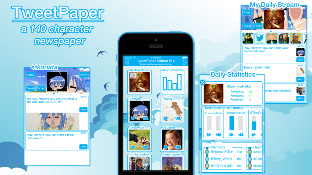
What is TweetPaper?
TweetPaper is a Twitter Client.

So? There are a lot of Twitter Clients in the AppStore.
Indeed, you are right.

What’s so special about it?
It depends on what you consider special. It can’t turn water into wine or iron into gold. But what it can do is display your Twitter feeds in a new way.

In a new way?
Yes, TweetPaper organizes your tweets into 3 separate view-frames (today, yesterday and days ago).

Ehm… view-frame?
Yeah, weird name. Open for suggestions. But the point is that a view-frame only contains tweets for the day of interest.

Day of interest?
“Today” is for the current tweets and “yesterday” for all the tweets from yesterday.
“Days ago” is a special one, which allows you to select a day and all the tweets of the selected day will be shown to you. It acts like an archive function.

Hmmm….what else can you tell me about view-frames?
A view-frame collects all the tweets of a day and analyzes the tweets specifics, like hashtags, mentions and retweets. All this info is gathered in the “Daily Statistics” frame that you can select.

Another frame?
Not quite, it more a part of the view-frame itself. Because each view-frame has one.

So it’s more a sub-frame or sub-view.
Yes, that’s the right programming term. But going back to the “Daily Statistics” frame, here you can find all kinds of tweet statistics. Like how many tweets or retweets was send by you or the persons that you follow. And when you click on them you’ll see a graphic display of that info.
“Daily Statistics” also contains a daily top section. Daily top lists the top 3 in tweets, retweets, mentions and hashtags.

Hah…now I understand the name statistics.
Yes, but an easy and understandable one, with…

What ever! What else?
Daily Statistics also tracks your following and followers count.

Ahh…you’ve got my interest. Tell me more.
The info is listed at the top. When you gain followers, you’ll see the gained amount in green. This also applies for following and favorites.

In green?
Yes, in green. Because it turns red when you lose a follower or stop following someone. It’s a color choice.
Furthermore when you click on it, you’ll get a graphic chart about the changes.

Hmm ok. Anything else beside statistics?
At the bottom when you follow someone new, they will be listed there, profile picture changes and other updates.

No I mean something else beside statistics!
There is another sub frame called “My Daily Stream”. Just like “Daily Statistics” you’ll find it in all three of the view-frames.

What does “My Daily Stream” do?
It list all the tweets from the all persons that you follow in a “mini day” timeline.

Hmm that’s not really special.
Indeed, you are right again. But it’s there because… I can’t really omit it without other users complaining about missing it… can I?
It’s an expected feature nowadays.
But there is a twist.

A twist?
Yes “My Daily Stream” acts as the main stream of that day and contains all the tweets of all the persons that you follow.
And as the main stream it can be divided into sub streams.

Sub streams?
Yeah, sub streams… for lack of a better word choice. Again open for suggestions. Each person that you follow will have a sub stream. This opens up a faster way in navigating through your twitter feeds and allows you to ignore certain other tweets. There is also a hide function, by tapping on a user in the main stream you can hide their tweets.
Furthermore you can switch between the sub streams by swiping left or right and the next following person’s tweets will be shown.

Hmmm ok. What else?
To focus on the tweet message itself, all other non essential tweet info like replies, retweets and favorites counts are hidden. You can see them by tapping on the tweet.
Furthermore the reply, retweet and favorite buttons are all listed inside one button. A design choice.
Links in tweets can also be accessed with the more button.

Hmm design choice you say.
Yeah, that’s the hype and keyword nowadays.
Designed for iOS 7.
Minimalistic Design.
Colorful.
Gesture based navigation.
And some other design oriented words.
So yes a design choice. But also it felt right when I coded it like that. Of course things can change. Again open for suggestions.
Anyways try it out and let me know what you think.

So that’s all then?
No there is still a lot more to tell, like you can navigate between the view-frames with a swipe-drag gesture and see the paper folding animation (hence the name TweetPaper and also the newspaper aspect of news for a day).
TweetPaper was designed with the mindset: checking Twitter once or twice a day is enough.
To handle timezone difference and with it the date selection. All tweet follows the Twitter GMT-0 time and date creation notation. But but you can select a specific time zone in the settings menu (view-frame days ago, top right side).
Then there is customization where you can select a background image. And the special thing about this is…. you have to see it to understand it.
As for privacy concerns, all I can say is that I don’t collect them. All your Twitter statistics stays in TweetPaper. And when you delete the app all the data is deleted as well. You Twitter account is accessed using Apple’s social framework. You can allow access to it in the general settings menu.


TweetPaper Promo

TweetPaper Promo


App update: Vitamins 101 (2.4)

20131108-110623.jpg

Like everything: it all starts with an idea. In this case an update for Vitamins 101. An idea for adding new features to it, like what about a compare option? Ok, I can do that.
What about some wiki info? Ok I can do that.
What about a DRI table? Ok, I can do that.
What about a conversion table? Ok, I can do…no wait a moment… I already did that.

Next question: where to put all this? A slide in table with buttons for all those option? A toolbar at the bottom? One button in the navigation bar that calls up a popover menu? A menu that comes up with a gesture?
Those are all possibilities. I guess it all depends on the taste and personal preferences. But I chose the separate button options…or more I started drawing a general layout of what I got from my previous update. Start at what you have. And from there I started to add the things I want. Draw a button there…and add an arrow. An new interface (which is just another square drawing). Put in some scribbles. No need for fancy things. Because it’s just me. I don’t have an independent developer who needs to read my scribbles & decipher the things I want. But sometimes I do need to switch between thought processes. Design issues in layout. I want it t look like this. But then the programmer in me thinks no… I can’t do that, it will lead to a crash. Or the Apple Human Interface Guidelines will reject that straight away. Yeah there is something like that. Anyways, where was I?

The creative process starts with an idea. And from there…it all depends on the person. I for one have to put it on paper first and visualize it in my mind. When I have the general picture. Then the coding starts. Sometimes fast and easy to execute. And sometimes painful with lots of crashes & error messages. Sigh…back to looking up through code examples and libraries. And the painful feeling man I don’t know anything. I don’t understand it. Why can’t I do it in one try? So needless to say lots of negative feelings. And some inner screaming. Arghh….

But why do you keep or choose this line of work? Ehm…don’t know. But one thing is for sure when I do find the answer I’ll let you know.
Live is full with ups and downs. Negative feelings…and positive feelings. All I can hope that it balances out in the end.
Anyways enough of my random thoughts. The update for Vitamins 101 is done. It’s at version 2.4 now. Let me know what you think….


The digital result:

Guide1_Vitamins

Different iOS Icon Sizes

A quick reference post about iOS Icon Sizes.

iOS 6 and lower

iPhone 3GS and lower (Non Retina Display)

Icon-57.png

Amy-57


iPhone 4 and higher (Retina Display)

Icon-114.png

Amy-114


iPad and iPad mini (Non Retina Display)

Icon-72.png

Amy-72


iPad (Retina Display)

Icon-144.png

Amy-144


iOS 7 and up

iPhone 4 and up

Icon-120.png

Amy-120


iPad and iPad mini (Non Retina Display)

Icon-76.png

Amy-76


iPad (Retina Display)

Icon-152.png

Amy-152

new iPhone 5C

iPhone5c_vs_iPodTouch5

When I look at the iPhone 5C, I can’t stop thinking that it looks a lot like the iPod Touch 5.

In design not much difference than the iPhone 5C being thicker, a mute switch on the side, a speaker on the top below the iSight camera in the front, a black front glass, no strap thingie button at the back and a single part hard-coated polycarbonate back.

So underwhelming or not when you look at product design in general?
On the other hand looking forward to the iPhone 5S! Fingerprint recognition with TouchID, 64 bit processor, motion processor and lots of camera fun.

But back to design and colors. I do like the overall package of the iPhone 5C in combination with iOS 7. The first step of hardware & software combined, all pointing back to Jonathan Ive.